
Website accessibility covers many steps, but what does it mean? Let’s just break it down. Accessibility means building inclusive websites so that people who are differently abled can access them without the barriers and frustrations that might otherwise occur.
There are a few good reasons you want to follow website accessibility best practices; we’ll go into those later.
In this article, I will talk you through some of the best practices that you can start putting in place today.
Why Do You Need To Follow Website Accessibility Best Practices?
According to statistics from the World Health Organization (WHO), there are one billion people worldwide with disabilities, and these numbers are increasing.
For people with disabilities that rely on the internet for information, goods, and services, accessing information often isn’t as easy as it could be.
However, website accessibility best practices ensure everyone can use all of a given website’s features. After all, in this day and age, everyone should have equal access to information and resources online.
Accessibility is about more than ensuring your visitors can get the information they need, though. There’s also the business side.
Making your website accessible to a wider range of people can only increase your customer base and improve your bottom line while boosting your SEO.
Additionally, there are legal implications of not following website accessibility best practices; failure to abide by ADA website compliance can lead to heavy fines.
Ready to get started? Here are ten best practices for website accessibility.
1. Make Sure All Your Images Have Alt Text
55 percent of websites don’t use alt text. You don’t want to be one of them. Why? Well, for one thing, alt text is a short description of the image used by screen readers to help visually impaired users understand what the image is.
Alt text also displays text if the image doesn’t load properly, so visitors to your site or readers of your newsletter know what image is supposed to be there.
Additionally, alt text aids SEO by helping search engines to understand the content of your images.
Adding alt text to your images is one of the easiest accessibility steps to implement. It ensures everyone can process and enjoy your content.
Here are a few tips for writing good alt text:

- Keep it short and sweet. Alt text should be no more than a few words long.
- Be clear and concise. Use simple language that everyone can understand.
- Include keywords, but don’t keyword stuff
- Be specific
- Use alt text for buttons like ‘search’ and ‘apply’
Add Transcripts and Captions for Audio and Video Content
Transcripts and captions make your content more accessible to people with hearing impairments or who don’t speak the same language as your video. Transcripts and captions also make it easier for people to follow along with complex audio or video content.
However, captions have wider applications than accessibility and help the likes of Google understand your video content.
Additionally:
- 96 percent find the use of captions helpful
- 75 percent say captions assist learning
- 71 percent without hearing problems use captions.
To add captions, you can use a free caption generator like Veed. Just click on the blue ‘get started’ link, then upload a file or paste your link.
2. Ensure Your Site’s Text Is Easily Readable
Clear, easy-to-read text is essential for every website owner, but it’s especially important for people with visual impairments or learning disabilities.
How you present text enhances the user experience, and it’s not just about the style of font you use.
As Harvard University explains, some users struggle to follow text if the line height is too wide or narrow. Others need the option to enlarge text to read it, while others can’t view content if the text is too small or doesn’t scale.
To help improve the experience for your visitors, Harvard Digital has the following tips for optimizing readability:
- Consider spacing: The use of space is important in visual design and helps users identify related and unrelated text. Ensure you have the correct amount of space between sentences for easy readability. Also, don’t add two spaces following a period.
- Typography: for clarity and consistency, stick to the same typeface across the website.
- Avoid all caps: Text written all in caps is considered ‘shouting,’ and you don’t want your visitors to feel you’re shouting at them. All caps are also difficult to read.
- Text: Don’t use underlining unless it’s for links, and left align your text.
- Resizing: Make sure your site supports text resizing and doesn’t use narrow columns of text, as they may make scaling difficult.
- Choose accessible fonts for users with vision difficulties or learning disabilities: Tahoma, Calibri, Helvetica, Arial, Verdana, and Times New Roman are all accessible. Arvo, Museo Slab, and Rockwell are suitable as heading fonts.
Other fonts you might consider include:
- PT Sans
- Raleway
- And Lato
If you want a strong example of a site that executes this well, look at Huffington Post.

Consistent, legible typography and spacing make these headlines easier to read.
3. Design Forms To Be Usable By Everyone
Good design is an essential part of any website, and as part of the overall look, you’ll want to spend some time focusing on the forms.
Here are some website accessibility best practices for designing forms that are usable by everyone:
1. Make sure all form fields are labeled clearly. This will help users understand what information is required in each field.
2. Use larger font sizes for labels and instructions to make them easier to read, especially for users with vision impairments.
3. Use contrasting colors for labels and form fields to improve usability for all users and for users with color blindness.
4. Structure the form logically, so that related fields are grouped to make it easier for users to fill out the form correctly.
5. Avoid using complex CAPTCHA codes to verify that a user is human. You can use alternatives like phone verification, Google reCAPTCHA, and hCAPTCHA.
6. Make sure they have keyboard navigation, and are compatible with screen readers.
Let’s move on to how to make your website easily navigable with a keyboard.
4. Make Your Site Fully Navigable Via Keyboard
As a website owner, it’s important to ensure your site is fully navigable via keyboard. While many of your users may default to a mouse or touch screens, some with people fine motor disabilities or visual impairments have to use keyboards. This is a best practice for website accessibility and helps ensure that all users can navigate your site easily.
There are some simple steps you can apply to achieve this.
- First, all links should be focusable using the Tab key, meaning users can tab through all of the links on your site and easily access them.
- Second, all form elements should be usable without a mouse.
- Label all form elements properly, so users know what they need to do when filling out forms on your website.
- Clearly label all buttons, so users know what actions they will trigger when clicked.
- Finally, convey all important information via text, not images.
Not sure if your website is up to standard? Then begin by testing your website for keyboard navigation to make your site more user-friendly for people with motor impairments or vision difficulties.
Several tools are available to check accessibility with a screen reader for users with vision difficulties, including:
- Chrome’s screen reader
- Apple Voiceover
5. Don’t Only Use Color To Portray Information
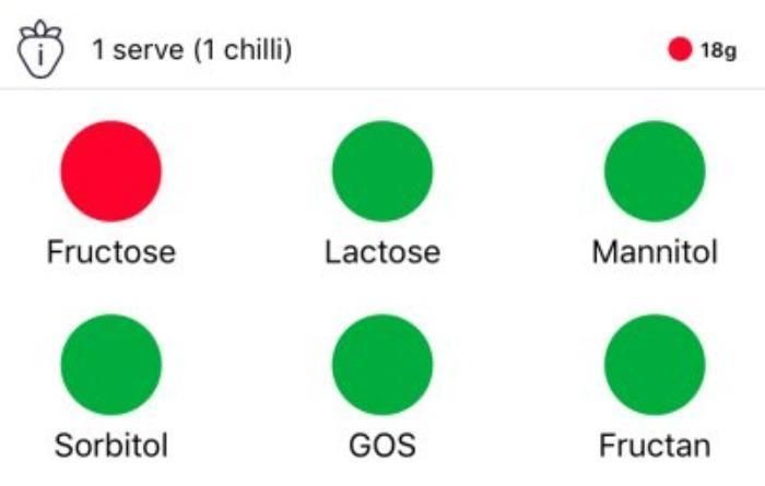
Over 300 million people have colorblindness globally, and it’s beneficial for your business to cater to them.
To further assist users with color blindness, give some consideration to your color schemes. For instance, the FODMAP app makes it easy for users to differentiate colors:
You’ll also want to avoid certain color combinations. To help with this, ColorBrewer has a tool to enable better color choices.
While color is one important factor in making a website accessible to all users, many other areas are worth considering. Here are some tips for aiding wider accessibility.
1. Use a variety of colors and contrast levels.
2. Make sure text can be resized without losing readability.
3. Provide alternative methods of conveying information (e.g., audio, video, tactile).
4. Use clear and concise language throughout the site.
5. Test your site regularly to ensure it meets current accessibility standards.
6. Make All Interactable Elements Easy To Identify
One of the most important best practices for accessibility is ensuring all interactable elements, like forms, navigation menus, and social buttons, are easy to identify.
There are a few ways to do this. You can:
- Make all links clearly distinguishable from the surrounding text. Links should be a different color, underlined, or otherwise set apart.
- Create clear form fields, so they’re easy to find. Users should be able to tell at a glance what information is requested in each field.
- Use descriptive text for alt text.
- Add buttons for clickable actions like downloads.
- If the link takes users to a new tab, indicate this with link text.
- Finally, buttons should be large and easily clickable.
7. Be Sure To Implement Proper Heading Markup For All Content
Heading markup helps make your site more accessible to those with visual disabilities by helping with navigation. Below are some tips for implementing heading markup for your content.
Structure: Use headings to break up your text into sections and subsections. For example, if you have an article with three main sections, you would use h1 tags for the article title and h2 tags for the section titles.
Use subheadings: You can further break up the text within each section using h3 tags for subheadings. This helps readers scan your content more easily and has the added bonus of making it easier for search engines to index your pages.
Put your headings in order: When using headings, be sure to use them in order (h1, h2, h3, etc.), like this:

It’a also worth noting that heading markup also improves your site’s search engine optimization (SEO).
8. Write Clear and Actionable Error Messages
Error messages are often the first thing a user sees when something goes wrong. They can be frustrating, confusing, and even scary for some. They can impact your website rankings, too.
However, with a little thought and care, you can write error messages that are helpful and informative.
Here are some tips for writing clear and actionable error messages:
- Keep it short and sweet. No one wants to read a novel when they’re trying to figure out what went wrong.
- Be specific. Tell the user exactly what happened and what they can do about it.
- Use plain language. Avoid technical jargon or acronyms that the user might not understand.
- Be positive. Give directions so the user knows what to do in case of an error or offer a solution.
- Don’t overuse error messages and put them in the correct format, like a modal dialogue box.
Here’s one area where I lead by example. Say that you misspelled a URL on my site and got a 404 error. Here’s what you see:
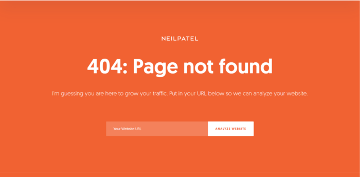
Nice and simple, and as a bonus, I put an additional feature here that my average reader still finds useful.
9. Build A Clear Site Navigation Plan
The way your overall website is organized and designed has a big impact on how easy it is for visitors to find their way around, not just the main navigation.
It’s pretty basic: Good navigation makes it easy for people to find the information they need, while bad navigation can leave them feeling confused and lost. By taking the time to plan out your navigation, you can ensure users can easily discover what they’re looking for.
Here’s an image that shows off what a basic strong navigation plan looks like:
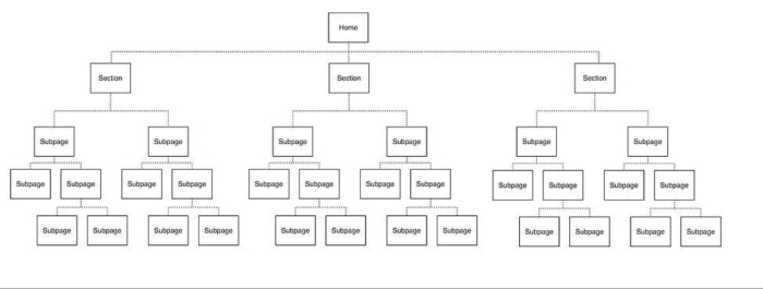
(source)
There are a few things to remember when creating your navigation plan.
- Think about the overall structure of your site. What are the main sections of your site? How will users move from one section to another?
- Make the ‘navigation’ button easy to find and put it on the same place for every page.
- Don’t use an excessive amount of links.
- Next, consider the individual pages on your site. What is the hierarchy of information on each page? How can users drill down to the specific information they need?
- Provide calls to action so visitors know what you want them to do next.
- Finally, think about how you will label each link in your navigation. Use clear and concise labels that accurately reflect the linked page’s content. Avoid using generic labels such as “click here” or “more.”
10. Don’t Be Afraid To Use Tools For Support
If website accessibility best practices feel overwhelming, then start by doing an assessment with tools.
I’ve already mentioned a couple earlier in the article, but there are many more available, and W3.org offers an extensive list, such as:
- Contrast accessibility checkers
- HTML code checkers
- Accessibility color wheels and checkers
- Scanner and monitoring tools
FAQs
What does website accessibility mean?
Website accessibility means that users who are differently abled can fully access and use a website. You can enhance accessibility through a variety of means, such as adding alt text to images or using descriptive links.
Other top website accessibility best practices include providing alternatives for non-text content, and ensuring ease of navigation.
How can I create an accessible website?
There are many ways to make a website accessible. Best practices include:
1. Using clear and concise language.
2. Enabling keyboard or screen reader navigation.
3. Using alternative text for images and videos.
4. Providing captions for audio content.
5. Design your pages to be easily resized or zoomed in without losing functionality.
Will having an accessible website boost my SEO performance?
Yes, applying website accessibility best practices boosts your SEO performance. Simply put, when you make your site more accessible, search engines find it easier to understand.
Conclusion
With the internet being such a pivotal part of everyone’s daily lives, you want your site to be accessible to all.
While everyone benefits from a site that’s easy to navigate, read, and understand, this is especially crucial for people with disabilities.
By applying some simple website accessibility best practices, you can ensure that everyone feels welcome on your site while enhancing the overall experience for everyone.
An accessible website also benefits you as a website owner in terms of SEO performance, potentially increasing your leads and conversions.
What website accessibility best practices do you use on your website?

See How My Agency Can Drive More Traffic to Your Website
- SEO - unlock more SEO traffic. See real results.
- Content Marketing - our team creates epic content that will get shared, get links, and attract traffic.
- Paid Media - effective paid strategies with clear ROI.
Unlock Thousands of Keywords with Ubersuggest
Ready to Outrank Your Competitors?
- Find long-tail keywords with High ROI
- Find 1000s of keywords instantly
- Turn searches into visits and conversions
Free keyword research tool