Taking on the challenge of rebranding your business can end up being a hit or a miss, depending on how you go about it. It requires time and thought to get it right, and not all companies succeed.
Just look at the extreme rebranding of Twitter recently. Is it a success, or will it be the end of the social media platform for good?
Whether you plan to modify your company’s name, change your messaging, or redesign your logo or other element of your product or service, a good place to start is to learn through the experiences of other companies.
To help you gain a glimpse of efforts that both succeed and fall short, below we provide four famous rebranding examples.
Download this post by entering your email below
Two Examples of Rebranding Done Right
1- Apple, Inc.
Apple is one of the most valuable brands in the world, and the company’s rebranding helped its status in 1997. Before this time, Apple was called “Apple Computer Company” and it was synonymous with computers only.
Rebranding strategies
They did something pretty smart: they dropped the “computer” from their name, becoming simply Apple Inc. This move opened up a whole new world of possibilities for them to branch out into different products.
At the same time, they gave their logo a makeover. Out went the colorful version, and in came a sleek, modern look with just one color. It was like the apple grew up.
Positive outcomes and market responses
This rebranding paved the way for Apple to unleash a wave of cool new products like the iPod, iTunes, iPhone, and iPad. They didn’t just stay relevant; they became the go-to brand for cutting-edge tech.
Lessons for marketers and brand owners
The big takeaway here? A successful rebrand can help you break into new markets, grow your business, and keep your customers coming back for more. By tweaking their name and logo, Apple managed to stay true to their tech roots while expanding into new horizons.
2- Coca-Cola
Coca-Cola hasn’t just had one rebranding, but several over the years, so they know what works and what doesn’t.
A brief history of Coca-Cola’s rebranding includes:
- 1985: Introduction of a new Coke can, which is now iconic with the brand
- 2001: A logo change, creating a more modern look.
- 2005: Slight revision of their messaging, focusing more on happiness.
- 2016: A refresh of the Coke logo with a new campaign called “Taste the Feeling” to promote an emotional connection to the brand.
- 2021: Introduction of the ‘One Brand’ strategy, helping customers realize that all of their Coca-Cola brands (Coke Zero, Diet Coke, etc.) are enjoyable and as good as their signature product.
All of these changes were successful.
The brand deserves credit for staying relevant in an increasingly crowded beverage market and staying in tune with industry trends. These changes positively impacted consumer perception and sales.
Key takeaways for marketers and brand owners
A few lessons from Coca-Cola’s rebranding efforts:
- Create an emotional connection with customers.
- Refresh your messaging occasionally to reflect the current times.
- Modify your logo to stay relevant and grab consumers’ attention.
- Stay involved in your industry, keeping an eye on the latest trends and happenings.
Coca-Cola shows how to maintain your brand’s value while still refreshing it to attract more customers.
Two Examples of Rebranding Done Wrong
1- Gap
As an established clothing retailer, Gap sought to rebrand itself following the 2008 Financial Crisis, leading to a sales slump. The rebranding attempt centered on the creation of a new logo for the brand and, unfortunately, not much more.
While the Gap logo had been in place for 20 years (1990-2010), the company felt a change would alert consumers that it was still relevant, modern, and even exciting again.
It failed miserably.
It only took a week for the brand to see their error, and they reverted to the tried-and-true logo of the past. As such, Gap experienced a failed rebranding strategy.
Reasons behind the failure
The approach failed because, to undergo a visual rebranding, Gap did not accompany the logo change with any other substantial change in strategy, such as its messaging.
The company did not build up the reveal of a new logo, creating anticipation and curiosity, but instead simply made the change across all channels overnight.
In other words, it didn’t tell consumers what they could expect with this new image they wished to project.

The impetus for the logo redesign was more about falling sales than customer loyalty and brand recognition.
Negative repercussions on brand image and customer loyalty
Such an abrupt change in logo received a huge amount of negative backlash from customers.
No other change — organizational, product, or otherwise — seemed to accompany the new logo, and, it not only confused customers but also made them angry. They felt cheated as the brand chose not to include them in the change beforehand.
Social media became the center of the backlash, with negative reactions to the new logo and the brand itself.
Lessons for marketers and brand owners
Before making any changes, first evaluate the value of your brand. Gap failed to take into account the brand recognition it had built throughout the years.
Your logo is a connecting element between your brand and consumers. When you make changes to it, be sure to accompany it with wider changes to your business and branding strategies. Otherwise, you risk damaging your reputation and alienating customers.
Create messaging to go along with your rebranding. Content marketing is key to a successful launch of your new image.
Finally, always stay aware of the power of social media. It doesn’t take long for things to go haywire on these platforms, so have a social media crisis management plan in place should you find yourself in a negative situation.
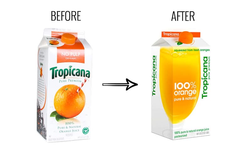
2- PepsiCo’s Tropicana
In 2009, the brand Tropicana, owned by PepsiCo, decided to replace the packaging design of its bestselling juice product, Tropicana Pure Premium orange juice. While the packaging redesign was accompanied by an advertising campaign with new messaging, it still failed.
Design changes and consumer backlash
The design changes were extreme, making the product almost unrecognizable to customers. It replaced the orange with a straw sticking out of it with a glass full of orange juice. There were also other changes, including in the logo design.
Consumer backlash ensued. The brand received criticism from consumers almost instantly, especially on social media, and even rejection of its product.
It soon became evident that the new packaging and accompanying advertising campaign were a failure. The company had no choice but to return to the original design.
Financial impact and market share decline
Prior to the attempted rebranding, Tropicana Pure Premium brought in annual sales revenues of over 700 million dollars. However, in the few months following that failed rebranding, sales dipped by 20%, resulting in a 30 million dollar loss for Tropicana.
The brand’s competitors wasted no time swooping in and gaining customers and sales.
Key issues for marketers and brand owners
As a result of this failed attempt, there are several key issues to remain aware of when rebranding.
- Consumers can have emotional connections with product appearance, so package design is important.
- Avoid changing too many brand elements on packaging at the same time. Tropicana created a new logo, slogan, image, typography, and lid and applied them all at once, and confused customers.
- Packaging sells the product in many instances, so make sure you include it as an essential part of the branding.
Rebranding Examples FAQs (Frequently Asked Questions)
What is rebranding with example?
Rebranding is the process of giving a brand a new identity to change its perception or market position. An example of rebranding is when Instagram changed its logo and app design in 2016 to reflect a more modern and colorful aesthetic.
Are brand updates and rebranding the same thing?
No. While both concepts involve modifications to a brand’s identity, a brand update typically entails smaller adjustments to maintain relevance, while rebranding involves more substantial changes to transform the brand’s identity significantly.
What is an example of a brand update?
An example of a brand update is when Pepsi updated its logo and packaging design in 2008, moving from the old, italicized logo to a more modern, flat design with a smile-like shape.
What is an example of a rebranding pitch?
A rebranding pitch is a presentation or proposal outlining the reasons and strategies for rebranding a company. An example would be a marketing agency pitching to a client, suggesting a rebranding strategy to revitalize their brand image and appeal to a new target audience.
Increase the Strength of Rebranding With the Right Content and Messaging
Rebranding takes considerable resources, and getting each element right is essential to customer loyalty as well as your bottom line.
You’ll need to accompany changes in name, logo design, packaging, and messaging with new content that speaks to the heart of your customers and captures the interest of potential new ones. That is where WriterAccess can help.
Our professional writers understand how essential branding is to your success and know how to create the content you need for your rebranding efforts. Find out more today by signing up for our free 14-day trial.