As a writer for the marketing blog, I frequently use various types of charts and graphs to help readers visualize the data I collect and better understand their significance. And trust me, there's a lot of data to present.

In fact, the volume of data in 2025 will be almost double the data we create, capture, copy, and consume today.

This makes data visualization essential for businesses. Different types of graphs and charts can help you:
- Motivate your team to take action.
- Impress stakeholders with goal progress.
- Show your audience what you value as a business.
Data visualization builds trust and can organize diverse teams around new initiatives. So, I'm going to talk about the types of graphs and charts that you can use to grow your business.
And, if you still need a little more guidance by the end of this post, check out our data visualization guide for more information on how to design visually stunning and engaging charts and graphs.
.png)
Free Excel Graph Templates
Tired of struggling with spreadsheets? These free Microsoft Excel Graph Generator Templates can help.
-
Simple, customizable graph designs.
-
Data visualization tips & instructions.
-
Templates for two, three, four, and five-variable graph templates.
Charts vs Graphs: What's the Difference?
A lot of people think charts and graphs are synonymous (I know I did), but they're actually two different things.
Charts visually represent current data in the form of tables and diagrams, but graphs are more numerical in data and show how one variable affects another.
For example, in one of my favorite sitcoms, How I Met Your Mother, Marshall creates a bunch of charts and graphs representing his life. One of these charts is a Venn diagram referencing the song "Cecilia" by Simon and Garfunkle.
Marshall says, "This circle represents people who are breaking my heart, and this circle represents people who are shaking my confidence daily. Where they overlap? Cecilia."
The diagram is a chart and not a graph because it doesn't track how these people make him feel over time or how these variables are influenced by each other.
It may show where the two types of people intersect but not how they influence one another.

Later, Marshall makes a line graph showing how his friends' feelings about his charts have changed in the time since presenting his "Cecilia diagram.
Note: He calls the line graph a chart on the show, but it's acceptable because the nature of line graphs and charts makes the terms interchangeable. I'll explain later, I promise.
The line graph shows how the time since showing his Cecilia chart has influenced his friends' tolerance for his various graphs and charts.

I can't even begin to tell you all how happy I am to reference my favorite HIMYM joke in this post.
Now, let's dive into the various types of graphs and charts.
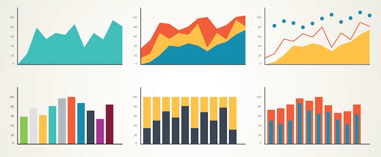
Different Types of Graphs for Data Visualization
1. Bar Graph
I strongly suggest using a bar graph to avoid clutter when one data label is long or if you have more than 10 items to compare. Also, fun fact: If the example below was vertical it would be a column graph.

Best Use Cases for These Types of Graphs
Bar graphs can help track changes over time. I've found that bar graphs are most useful when there are big changes or to show how one group compares against other groups.
The example above compares the number of customers by business role. It makes it easy to see that there is more than twice the number of customers per role for individual contributors than any other group.
A bar graph also makes it easy to see which group of data is highest or most common.
For example, at the start of the pandemic, online businesses saw a big jump in traffic. So, if you want to look at monthly traffic for an online business, a bar graph would make it easy to see that jump.
Other use cases for bar graphs include:
- Product comparisons.
- Product usage.
- Category comparisons.
- Marketing traffic by month or year.
- Marketing conversions.
Design Best Practices for Bar Graphs
Use consistent colors throughout the chart, selecting accent colors to highlight meaningful data points or changes over time.
You should also use horizontal labels to improve its readability, and start the y-axis at 0 to appropriately reflect the values in your graph.
2. Line Graph
A line graph reveals trends or progress over time, and you can use it to show many different categories of data. You should use it when you track a continuous data set.
This makes the terms line graphs and line charts interchangeable because the very nature of both is to track how variables impact each other, particularly how something changes over time. Yeah, it confused me, too.

Best Use Cases for These Types of Graphs
Line graphs help users track changes over short and long periods. Because of this, I find these types of graphs are best for seeing small changes.
Line graphs help me compare changes for more than one group over the same period. They're also helpful for measuring how different groups relate to each other.
A business might use this graph to compare sales rates for different products or services over time.
These charts are also helpful for measuring service channel performance. For example, a line graph that tracks how many chats or emails your team responds to per month.
Design Best Practices for Line Graphs
- Use solid lines only.
- Don't plot more than four lines to avoid visual distractions.
- Use the right height so the lines take up roughly 2/3 of the y-axis' height.
3. Bullet Graph
A bullet graph reveals progress towards a goal, compares this to another measure, and provides context in the form of a rating or performance.

Best Use Cases for These Types of Graphs
In the example above, the bullet graph shows the number of new customers against a set customer goal. Bullet graphs are great for comparing performance against goals like this.
These types of graphs can also help teams assess possible roadblocks because you can analyze data in a tight visual display.
For example, I could create a series of bullet graphs measuring performance against benchmarks or use a single bullet graph to visualize these KPIs against their goals:
- Revenue.
- Profit.
- Customer satisfaction.
- Average order size.
- New customers.
Seeing this data at a glance and alongside each other can help teams make quick decisions.
Bullet graphs are one of the best ways to display year-over-year data analysis. YBullet graphs can also visualize:
- Customer satisfaction scores.
- Product usage.
- Customer shopping habits.
- Social media usage by platform.
Design Best Practices for Bullet Graphs
- Use contrasting colors to highlight how the data is progressing.
- Use one color in different shades to gauge progress.
4. Column + Line Graph
Column + line graphs are also called dual-axis charts. They consist of a column and line graph together, with both graphics on the X axis but occupying their own Y axis.

Download our FREE Excel Graph Templates for this graph and more!
Best Use Cases
These graphs are best for comparing two data sets with different measurement units, such as rate and time.
As a marketer, you may want to track two trends at once.
Design Best Practices
Use individual colors for the lines and colors to make the graph more visually appealing and to further differentiate the data.
Free Excel Graph Templates
Tired of struggling with spreadsheets? These free Microsoft Excel Graph Generator Templates can help.
-
Simple, customizable graph designs.
-
Data visualization tips & instructions.
-
Templates for two, three, four, and five-variable graph templates.
The Four Basic Types of Charts
Before we get into charts, I want to touch on the four basic chart types that I use the most.
1. Bar Chart
Bar charts are pretty self-explanatory. I use them to indicate values by the length of bars, which can be displayed horizontally or vertically. Vertical bar charts, like the one below, are sometimes called column charts.

2. Line Chart
I use line charts to show changes in values across continuous measurements, such as across time, generations, or categories. For example, the chart below shows the changes in ice cream sales throughout the week.

3. Scatter Plot
A scatter plot uses dotted points to compare values against two different variables on separate axes. It's commonly used to show correlations between values and variables.

4. Pie Chart
Pie charts are charts that represent data in a circular (pie-shaped) graphic, and each slice represents a percentage or portion of the whole.
Notice the example below of a household budget. (Which reminds me that I need to set up my own.)
Notice that the percentage of income going to each expense is represented by a slice.

Different Types of Charts for Data Visualization
To better understand chart types and how you can use them, here's an overview of each:
1. Column Chart
Use a column chart to show a comparison among different items or to show a comparison of items over time. You could use this format to see the revenue per landing page or customers by close date.

Best Use Cases for This Type of Chart
I use both column charts to display changes in data, but I've noticed column charts are best for negative data. The main difference, of course, is that column charts show information vertically while bar charts show data horizontally.
For example, warehouses often track the number of accidents on the shop floor. When the number of incidents falls below the monthly average, a column chart can make that change easier to see in a presentation.
In the example above, this column chart measures the number of customers by close date. Column charts make it easy to see data changes over a period of time. This means that they have many use cases, including:
- Customer survey data, like showing how many customers prefer a specific product or how much a customer uses a product each day.
- Sales volume, like showing which services are the top sellers each month or the number of sales per week.
- Profit and loss, showing where business investments are growing or falling.
Design Best Practices for Column Charts
- Use consistent colors throughout the chart, selecting accent colors to highlight meaningful data points or changes over time.
- Use horizontal labels to improve readability.
- Start the y-axis at 0 to appropriately reflect the values in your chart.
2. Area Chart
Okay, an area chart is basically a line chart, but I swear there's a meaningful difference.
The space between the x-axis and the line is filled with a color or pattern. It is useful for showing part-to-whole relations, like showing individual sales reps’ contributions to total sales for a year.
It helps me analyze both overall and individual trend information.

Best Use Cases for These Types of Charts
Area charts help show changes over time. They work best for big differences between data sets and help visualize big trends.
For example, the chart above shows users by creation date and life cycle stage.
A line chart could show more subscribers than marketing qualified leads. But this area chart emphasizes how much bigger the number of subscribers is than any other group.
These charts make the size of a group and how groups relate to each other more visually important than data changes over time.
Area charts can help your business to:
- Visualize which product categories or products within a category are most popular.
- Show key performance indicator (KPI) goals vs. outcomes.
- Spot and analyze industry trends.
Design Best Practices for Area Charts
- Use transparent colors so information isn't obscured in the background.
- Don't display more than four categories to avoid clutter.
- Organize highly variable data at the top of the chart to make it easy to read.
3. Stacked Bar Chart
I suggest using this chart to compare many different items and show the composition of each item you’re comparing.

Best Use Cases for These Types of Charts
These charts are helpful when a group starts in one column and moves to another over time.
For example, the difference between a marketing qualified lead (MQL) and a sales qualified lead (SQL) is sometimes hard to see. The chart above helps stakeholders see these two lead types from a single point of view — when a lead changes from MQL to SQL.
Stacked bar charts are excellent for marketing. They make it simple to add a lot of data on a single chart or to make a point with limited space.
These charts can show multiple takeaways, so they're also super for quarterly meetings when you have a lot to say but not a lot of time to say it.
Stacked bar charts are also a smart option for planning or strategy meetings. This is because these charts can show a lot of information at once, but they also make it easy to focus on one stack at a time or move data as needed.
You can also use these charts to:
- Show the frequency of survey responses.
- Identify outliers in historical data.
- Compare a part of a strategy to its performance as a whole.
Design Best Practices for Stacked Bar Charts
- Best used to illustrate part-to-whole relationships.
- Use contrasting colors for greater clarity.
- Make the chart scale large enough to view group sizes in relation to one another.
Free Excel Graph Templates
Tired of struggling with spreadsheets? These free Microsoft Excel Graph Generator Templates can help.
-
Simple, customizable graph designs.
-
Data visualization tips & instructions.
-
Templates for two, three, four, and five-variable graph templates.
4. Mekko Chart
Also known as a Marimekko chart, this type of chart can compare values, measure each one's composition, and show data distribution across each one.
It's similar to a stacked bar, except the Mekko's x-axis can capture another dimension of your values — instead of time progression, like column charts often do. In the graphic below, the x-axis compares the cities to one another.

Best Use Cases for This Type of Chart
I typically use a Mekko chart to show growth, market share, or competitor analysis.
For example, the Mekko chart above shows the market share of asset managers grouped by location and the value of their assets. This chart clarifies which firms manage the most assets in different areas.
It's also easy to see which asset managers are the largest and how they relate to each other.
Mekko charts can seem more complex than other types of charts, so it's best to use these in situations where you want to emphasize scale or differences between groups of data.
Other use cases for Mekko charts include:
- Detailed profit and loss statements.
- Revenue by brand and region.
- Product profitability.
- Share of voice by industry or niche.
Design Best Practices for Mekko Charts
- Vary your bar heights if the portion size is an important point of comparison.
- Don't include too many composite values within each bar. Consider reevaluating your presentation if you have a lot of data.
- Order your bars from left to right in such a way that exposes a relevant trend or message.
5. Pie Chart
Remember, a pie chart represents numbers in percentages, and the total sum of all segments needs to equal 100%.

Best Use Cases for This Type of Chart
The image above shows another example of customers by role in the company.
The bar chart example shows you that there are more individual contributors than any other role. But this pie chart makes it clear that they make up over 50% of customer roles.
Pie charts make it easy to see a section in relation to the whole, so they are good for showing:
- Customer personas in relation to all customers.
- Revenue from your most popular products or product types in relation to all product sales.
- Percent of total profit from different store locations.
Design Best Practices for Pie Charts
- Don't illustrate too many categories to ensure differentiation between slices.
- Ensure that the slice values add up to 100%.
- Order slices according to their size.
6. Scatter Plot Chart
As I said earlier, a scatter plot or scattergram chart will show the relationship between two different variables or reveal distribution trends.
Use this chart when there are many different data points, and you want to highlight similarities in the data set. This is useful when looking for outliers or understanding your data's distribution.

Best Use Cases for These Types of Charts
Scatter plots are helpful in situations where you have too much data to see a pattern quickly. They are best when you use them to show relationships between two large data sets.
In the example above, this chart shows how customer happiness relates to the time it takes for them to get a response.
This type of chart makes it easy to compare two data sets. Use cases might include:
- Employment and manufacturing output.
- Retail sales and inflation.
- Visitor numbers and outdoor temperature.
- Sales growth and tax laws.
Try to choose two data sets that already have a positive or negative relationship. That said, this type of chart can also make it easier to see data that falls outside of normal patterns.
Design Best Practices for Scatter Plots
- Include more variables, like different sizes, to incorporate more data.
- Start the y-axis at 0 to represent data accurately.
- If you use trend lines, only use a maximum of two to make your plot easy to understand.
7. Bubble Chart
A bubble chart is similar to a scatter plot in that it can show distribution or relationship. There is a third data set shown by the size of the bubble or circle.

Best Use Cases for This Type of Chart
In the example above, the number of hours spent online isn't just compared to the user's age, as it would be on a scatter plot chart.
Instead, you can also see how the gender of the user impacts time spent online.
This makes bubble charts useful for seeing the rise or fall of trends over time. It also lets you add another option when you're trying to understand relationships between different segments or categories.
For example, if you want to launch a new product, this chart could help you quickly see your new product's cost, risk, and value. This can help you focus your energies on a low-risk new product with a high potential return.
You can also use bubble charts for:
- Top sales by month and location.
- Customer satisfaction surveys.
- Store performance tracking.
- Marketing campaign reviews.
Design Best Practices for Bubble Charts
- Scale bubbles according to area, not diameter.
- Make sure labels are clear and visible.
- Use circular shapes only.
8. Waterfall Chart
I sometimes use a waterfall chart to show how an initial value changes with intermediate values — either positive or negative — and results in a final value.
Use this chart to reveal the composition of a number. An example of this would be to showcase how different departments influence overall company revenue and lead to a specific profit number.
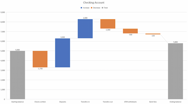
Best Use Cases for This Type of Chart
These types of charts make it easier to understand how internal and external factors impact a product or campaign as a whole.
In the example above, the chart moves from the starting balance on the far left to the ending balance on the far right. Factors in the center include deposits, transfers in and out, and bank fees.
A waterfall chart offers a quick visual, making complex processes and outcomes easier to see and troubleshoot. For example, SaaS companies often measure customer churn. This format can help visualize changes in new, current, and free trial users or changes by user segment.
You may also want to try a waterfall chart to show:
- Changes in revenue or profit over time.
- Inventory audits.
- Employee staffing reviews.
Design Best Practices for Waterfall Charts
- Use contrasting colors to highlight differences in data sets.
- Choose warm colors to indicate increases and cool colors to indicate decreases.
Free Excel Graph Templates
Tired of struggling with spreadsheets? These free Microsoft Excel Graph Generator Templates can help.
-
Simple, customizable graph designs.
-
Data visualization tips & instructions.
-
Templates for two, three, four, and five-variable graph templates.
9. Funnel Chart
A funnel chart shows a series of steps and the completion rate for each step. Use this type of chart to track the sales process or the conversion rate across a series of pages or steps.

Best Use Cases for These Types of Charts
The most common use case for a funnel chart is the marketing or sales funnel. But there are many other ways to use this versatile chart.
If you have at least four stages of sequential data, this chart can help you easily see what inputs or outputs impact the final results.
For example, a funnel chart can help you see how to improve your buyer journey or shopping cart workflow. This is because it can help pinpoint major drop-off points.
Other stellar options for these types of charts include:
- Deal pipelines.
- Conversion and retention analysis.
- Bottlenecks in manufacturing and other multi-step processes.
- Marketing campaign performance.
- Website conversion tracking.
Design Best Practices for Funnel Charts
- Scale the size of each section to accurately reflect the size of the data set.
- Use contrasting colors or one color in graduated hues, from darkest to lightest, as the size of the funnel decreases.
10. Heat Map
A heat map shows the relationship between two items and provides rating information, such as high to low or poor to excellent. This chart displays the rating information using varying colors or saturation.

Best Use Cases for Heat Maps
In the example above, the darker the shade of green shows where the majority of people agree.
With enough data, heat maps can make a viewpoint that might seem subjective more concrete. This makes it easier for a business to act on customer sentiment.
There are many uses for these types of charts. In fact, many tech companies use heat map tools to gauge user experience for apps, online tools, and website design.
Another common use for heat map charts is location assessment. If you're trying to find the right location for your new store, these maps can give you an idea of what the area is like in ways that a visit can't communicate.
Heat maps can also help with spotting patterns, so they're good for analyzing trends that change quickly, like ad conversions. They can also help with:
- Competitor research.
- Customer sentiment.
- Sales outreach.
- Campaign impact.
- Customer demographics.
Design Best Practices for Heat Map
- Use a basic and clear map outline to avoid distracting from the data.
- Use a single color in varying shades to show changes in data.
- Avoid using multiple patterns.
11. Gantt Chart
The Gantt chart is a horizontal chart that dates back to 1917. This chart maps the different tasks completed over a period of time.
Gantt charting is one of the most essential tools for project managers. It brings all the completed and uncompleted tasks into one place and tracks the progress of each.
While the left side of the chart displays all the tasks, the right side shows the progress and schedule for each of these tasks.
This chart type allows you to:
- Break projects into tasks.
- Track the start and end of the tasks.
- Set important events, meetings, and announcements.
- Assign tasks to the team and individuals.
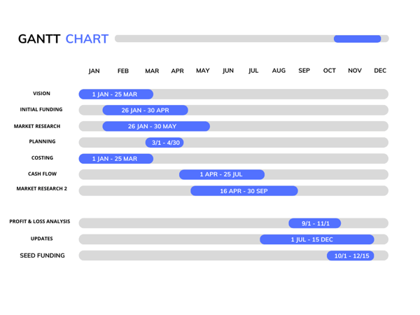
Best Use Cases for This Type of Chart
Gantt charts are perfect for analyzing, road mapping, and monitoring progress over a period of time.
The chart above divides the different tasks involved in product creation. Each of these tasks has a timeline that can be mapped on the calendar view.
From the vision and strategy to the seed funding round, the Gantt chart helps project management teams build long-term strategies.
The best part? You can bring the stakeholders, project team, and managers to a single place.
You can use Gantt charts in various tasks, including:
- Tracking employee records as a human resource.
- Tracking sales leads in a sales process.
- Plan and track construction work.
Design Best Practices for Gantt Charts
- Use same colors for a similar group of activities.
- Make sure to label the task dependencies to map project start and completion.
- Use light colors that align with the texts and grids of the chart.
12. Treemap
A treemap is a chart that represents hierarchical data in a tree-like diagram. As evident from the name, treemaps have data organized as branches and sub-branches.
The data in the chart is nested in the form of rectangles and sub-rectangles. Each of these rectangles and sub-rectangles has different dimensions and plot colors which are assigned w.r.t to the quantitative data.
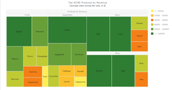
Best Use Cases for This Type of Chart
The treemap chart compares the different products in a category or sub-category. In the diagram above, the products are divided by revenue.
Look at the four parent categories: Fruits, Vegetables, Dairy, and Meat. This is followed by subsequent sub-categories or sub-products. The dimensions of these rectangles are in proportion to their numerical quantity and other rectangles in the same category.
The colors of these rectangles are plotted as per the revenue generated. Treemap charts are effective in differentiating between the products that lie in the same group but are divided into different sub-groups.
This form of mapping chart is best used:
- When there are hundreds of categories and even deeper layers of sub-categories. For example, Total votes cast w.r.t. States.
- To study the data with respect to only two quantitative values.
- To compare the performance of products and identify similarities and anomalies within a single or multiple categories.
Design Best Practices for Treemaps
- Use contrasting and bright colors to highlight differences between sub-categories.
- Organize the rectangles in order of larger area to smaller in size (i.e., from top to bottom).
- Mark down each rectangle with text or numbers to make it easy to read.
13. Donut Chart
A donut chart functions the same as a pie chart but is often preferred over the latter because the missing center makes the difference in data quantities more apparent.
Essentially, pie charts can be confusing at first glance because the human eye might not be able to discern the difference in size between each slice. Donut charts force the eye to look at the length of the perimeter, making it easier to discern size.

Download our FREE Excel Graph Templates for this graph and more!
Best Use Cases for This Type of Chart
I use donut charts for the same use cases as pie charts, but I tend to prefer the former because of the added benefit that the data is easier to read.
Another benefit to donut charts is that the empty center leaves room for extra layers of data, like in the examples above.
Design Best Practices for Donut Charts
Use varying colors to better differentiate the data being displayed, just make sure the colors are in the same palette so viewers aren't put off by clashing hues.
How to Choose the Right Chart or Graph for Your Data
Channels like social media or blogs have multiple data sources, and managing these complex content assets can get overwhelming. What should you be tracking? What matters most?
How do you visualize and analyze the data so you can extract insights and actionable information?
1. Identify your goals for presenting the data.
Before creating any data-based graphics, I ask myself if I want to convince or clarify a point. Am I trying to visualize data that helped me solve a problem? Or am I trying to communicate a change that's happening?
A chart or graph can help compare different values, understand how different parts impact the whole, or analyze trends. Charts and graphs can also be useful for recognizing data that veers away from what you’re used to or help you see relationships between groups.
So, clarify your goals then use them to guide your chart selection.
2. Figure out what data you need to achieve your goal.
Different types of charts and graphs use different kinds of data. Graphs usually represent numerical data, while charts are visual representations of data that may or may not use numbers.
So, while all graphs are a type of chart, not all charts are graphs. If you don't already have the kind of data you need, you might need to spend some time putting your data together before building your chart.
3. Gather your data.
Most businesses collect numerical data regularly, but you may need to put in some extra time to collect the right data for your chart.
Besides quantitative data tools that measure traffic, revenue, and other user data, you might need some qualitative data.
These are some other ways you can gather data for your data visualization:
- Interviews
- Quizzes and surveys
- Customer reviews
- Reviewing customer documents and records
- Community boards
Free Excel Graph Templates
Tired of struggling with spreadsheets? These free Microsoft Excel Graph Generator Templates can help.
-
Simple, customizable graph designs.
-
Data visualization tips & instructions.
-
Templates for two, three, four, and five-variable graph templates.
4. Select the right type of graph or chart.
Choosing the wrong visual aid or defaulting to the most common type of data visualization could confuse your viewer or lead to mistaken data interpretation.
But a chart is only useful to you and your business if it communicates your point clearly and effectively.
Ask yourself the questions below to help find the right chart or graph type.
Download the Excel templates mentioned in the video here.
5 Questions to Ask When Deciding Which Type of Chart to Use
1. Do you want to compare values?
Charts and graphs are perfect for comparing one or many value sets, and they can easily show the low and high values in the data sets. To create a comparison chart, use these types of graphs:
- Column
- Mekko
- Bar
- Pie
- Line
- Scatter plot
- Bullet
2. Do you want to show the composition of something?
Use this type of chart to show how individual parts make up the whole of something, like the device type used for mobile visitors to your website or total sales broken down by sales rep.
To show composition, use these charts:
- Pie
- Stacked bar
- Mekko
- Area
- Waterfall
3. Do you want to understand the distribution of your data?
Distribution charts help you to understand outliers, the normal tendency, and the range of information in your values.
Use these charts to show distribution:
- Scatter plot
- Mekko
- Line
- Column
- Bar
4. Are you interested in analyzing trends in your data set?
If you want more information about how a data set performed during a specific time, there are specific chart types that do extremely well.
You should choose one of the following:
- Line
- Dual-axis line
- Column
5. Do you want to better understand the relationship between value sets?
Relationship charts can show how one variable relates to one or many different variables. You could use this to show how something positively affects, has no effect, or negatively affects another variable.
When trying to establish the relationship between things, use these charts:
- Scatter plot
- Bubble
- Line
Featured Resource: The Marketer's Guide to Data Visualization

Download this free data visualization guide to learn which graphs to use in your marketing, presentations, or project — and how to use them effectively.
Put these new types of charts and graphs into action.
Now that you've chosen the best graph or chart for your project, try a data visualization resource that makes your point clear and visual.
Data visualization is just one part of great communication. To show your customers, employees, leadership, and investors that they're important, keep making time to learn.
Plus, data visualization adds a little razzle-dazzle to your business reports.
Editor's note: This post was originally published in November 2020 and has been updated for comprehensiveness.


![An Introduction to Data Visualization: How to Create Compelling Charts & Graphs [Ebook]](https://blog.hubspot.com/hubfs/data-visualization-guide.jpg)

![How to Create an Infographic Using Poll & Survey Data [Infographic]](https://blog.hubspot.com/hubfs/00-Blog_Thinkstock_Images/Survey_Data_Infographic.jpg)