Key Takeaways
- Dark Mode in email enhances readability and user experience by reducing eye strain and saving battery life, making it a crucial design consideration for modern email marketing.
- Email clients apply Dark Mode differently, with some inverting colors completely while others make partial adjustments—understanding these variations helps ensure consistent branding and design.
- Optimizing emails for Dark Mode requires strategic coding techniques, such as using @media (prefers-color-scheme: dark), custom color overrides, and Dark Mode-specific image adjustments to maintain visual appeal.
- Dark Mode impacts accessibility, benefiting some users while posing challenges for others—following best practices like contrast optimization ensures emails remain inclusive and readable.
Dark Mode. The tech industry started buzzing with these two words back when Apple added Dark Mode to its desktop email client in 2018. The following year, Dark Mode came to iOS Mail and other industry heavyweights, including Gmail, announced support for Dark Mode.
Litmus’ Email Client Market Share indicates that of the opens tracked, an average of 35% used Dark Mode in 2022, representing steady adoption year over year.Dark Mode has solidified its rightful place in the inbox—but making sure emails look great in this reading environment can be a big challenge for email marketers.
Consider this your all-in-one hub to all things Dark Mode, including Dark Mode code and hacks developed by Litmus and the email community, and a list of helpful Dark Mode tools email geeks trust and use often.
Part 1: Ultimate Guide to Dark Mode in Email
What Dark Mode is and why people use it
Dark mode is a darker color palette for low-light or nighttime environments. This reversed color scheme uses light-colored typography, UI elements, and icons on dark backgrounds—and it’s one of the hottest digital design trends in recent years. From Apple’s OS to apps like Twitter, Slack, or Facebook Messenger, most popular operating systems and apps now allow users to switch to Dark Mode.
Dark Mode is a hot topic—and for good reason. Many people prefer Dark Mode because:
- It’s easier on the eyes. Light text on a dark background is much better for minimizing eye strain, especially in low-light situations.
- It reduces screen brightness, saving your battery life.
- It can improve content legibility and can make it easier for some users to consume content on desktop and mobile.
They may simply have a preference for darker interfaces.
How are clients applying Dark Mode to my emails?
At the moment, there appear to be three fundamentally different types of color schemes that email clients use to apply Dark Mode to emails. Let’s look at them one by one (or jump straight to the Dark Mode Email Client Support Chart).
No color changes
Yes, you read right. Some email clients let you change their UI to Dark Mode, but that doesn’t have any impact on how your HTML email is rendered. Whether the app is set to Light or Dark Mode, your email will look exactly the same. Here’s a list of those clients:
- Apple Mail*
- Gmail Desktop
- AOL
- Yahoo mail
*Doesn’t change color modes if you leave out the Dark Mode meta tags. If you include the Dark Mode meta tags but don’t put any styles in, they give you a partial invert.
Check out this email example in Apple Mail: The design of the email stays exactly the same, no matter if you view it in the dark or light email client UI:
Apple Mail has a few exceptions to this: First, plain text emails do trigger the application of a Dark Mode theme, and the minimum code that blocks Dark Mode from applying to a plain text email is a 2×1 image—this is to ensure that you can include a 1×1 tracking pixel while retaining a “plain text” feel.
Secondly, If you enable Dark Mode as described below, then Apple Mail will auto convert your email to a Dark Mode Version using a partial invert (also described below).
Dark Mode options: default vs. custom
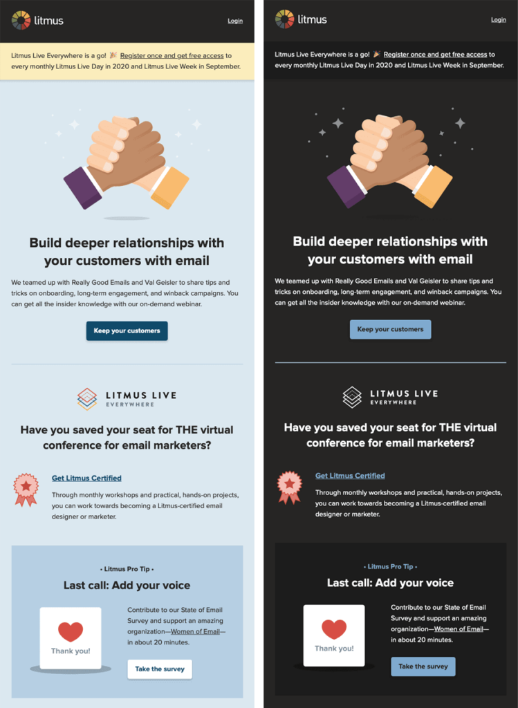
There are quite a few email clients that will automatically force their default Dark Mode onto your email if you don’t do anything at all. But if you’re like most of us and you’re not a fan of these Default styles, you might want to go with the third option: design and code your own Dark Mode theme. Below, you can see a side-by-side of an email with a Light Mode theme, and a Custom Dark Mode theme.
Before we look into how to approach a custom Dark Mode theme though, let’s check out how other email clients treat their Default Dark Modes.
Default Dark Modes: partial color invert
The first Dark Mode theme is what I like to call a “Partial Color Invert”. It only detects areas with light backgrounds and inverts them so the light backgrounds are dark, while the dark text becomes light.
It generally leaves areas that already have dark backgrounds alone, resulting in a fully Dark Mode design. Fortunately, most email clients that use this method also support Dark Mode targeting, so you can override the client-default dark theme.
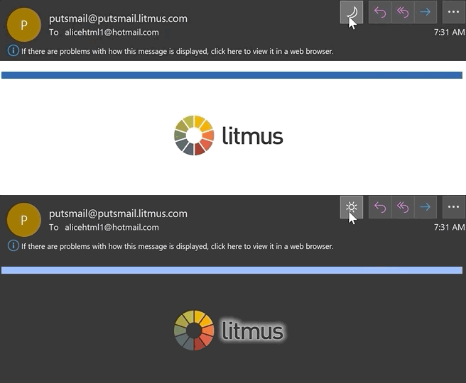
Outlook.com is an email client that partially inverts colors, like you can see in this screenshot:

Default Dark Modes: full color invert
The Full Color Invert is the most invasive color scheme: It not only inverts the areas with light backgrounds, but impacts dark backgrounds as well.
So if you already designed your emails to have a dark theme, this scheme will ironically force them to become light. Unfortunately, this is currently the tactic used by some of the more popular email clients, such as Gmail app (iOS), Outlook 2021 (Windows), Office 365 (Windows), and Windows Mail.
In the examples below, you can see the light backgrounds have been converted to dark versions of the original colors and areas that previously had a dark background with light text are now light with dark text.

Not only does this Full Color Invert scheme most radically change your email, but the email clients that use this logic also don’t allow Dark Mode targeting at the moment.
Email clients are still figuring out how to best implement Dark Mode and may be open to feedback from users—especially since not allowing email developers to target Dark Mode with their own styles can have a negative impact on legibility and accessibility.
In the interest of advocating for better Dark Mode targeting support and less invasive Dark Mode theming logic, you can communicate your thoughts directly to Gmail’s Accessibility team, and you can also contribute your screenshots of Gmail’s Dark Mode breaking your email.
Different Dark Mode targeting methods
As noted above, how email clients in Dark Mode handle your regular HTML emails will vary. But what if you’d like to apply your own Dark Mode styles that could very well differ from email clients’ default color schemes? There are two methods you can use.
@media (prefers-color-scheme: dark)
This method works in very much the same way as applying a block of styles inside a @media query for your Mobile Responsive view, except this CSS block targets any user interface that’s set to Dark Mode. @media (prefers-color-scheme: dark) allows you to create the most robust custom Dark Mode themes where you can implement anything from Dark Mode-specific image swaps, hover effects, background images… basically almost anything you can do with traditional CSS! This method requires you to add Dark Mode meta tags and styles to the <head> of your email in order to work in Apple Mail.
[data-ogsc]/[data-ogsb]
This is a method first brought to our attention by Mark Robbins to target the Outlook app. Not every style works with it, but it does work for image swapping on Outlook.com. While it seems like a pretty narrow market share, it’s relatively easy to simply duplicate the @media (prefers-color-scheme: dark) styles you already applied and simply add the appropriate [data-ogsc] prefixes to each CSS rule.
Which email clients support Dark Mode?
These clients and apps currently offer Dark Mode—either as a setting that the user can set manually or by automatically detecting the user’s preferred color scheme:
Mobile apps
Desktop clients
- Apple Mail
- Outlook 2021 (Mac OS)
- Outlook 2021 (Windows)
- Office365 (MacOS)
- Office365 (Windows)
- Windows Mail
Web clients
But just because all these email clients offer a way to set their UI to a dark color scheme, that doesn’t mean that they handle your emails the same way. Email rendering is complex. An email that looks great in one client might look broken in another. Now, Dark Mode is adding another layer of complexity. As we’ve already shown, there are various ways a Dark Mode email client might deal with your code.
And there’s no consistent support for the different targeting methods either. So which email client follows which color scheme by default? While some offer email designers no opportunities to target Dark Mode to optimize the reading experience, several email clients can be targeted with either the @media (prefers-color-scheme: dark) or [data-ogsc] methods.
We’ve tested the Dark Mode settings in the following email clients to see how they impact a regular email that doesn’t include any Dark Mode-specific targeting as well as support for targeting Dark Mode. Here’s what we found…
Email Dark Mode email client support chart (as of February 2025)
| Email Client | HTML Treatment in Dark Mode | @media support | [data‐ogsc] support | Forced background color support** | Quirks |
|---|---|---|---|---|---|
| Apple Mail (MacOS) | No change* | ✓ Yes | ✘ No | ✓ Yes | *Pure white (#ffffff) BGs will be inverted if <meta> is present |
| iPhone / iPad (iOS 16) | No change* | ✓ Yes | ✘ No | ✓ Yes | *Pure white (#ffffff) BGs will be inverted if <meta> is present |
| Outlook.com | Partial invert | ✘ No | ? Partial*† | ✘ No | *Lighter BG colors will be darkened†Image swap works if the image is linked |
| Outlook 2021 (WinOS) | Full invert* | ✘ No | ✘ No | ✘ No | *Special targeting is possible for VML sections. |
| Outlook app (iOS) | Partial invert | ✘ No | ? Partial*† | ✘ No | *Lighter BG colors will be darkened and light fonts on a dark background may be darkened†Image swap works if the image is linked |
| Outlook app (Android) | Partial invert | ✘ No | ? Partial*† | ✘ No | *Lighter BG colors will be darkened and light fonts on a dark background may be darkened†Image swap works if the image is linked |
| Gmail app (iOS) | Full invert* | ✘ No | ✘ No | ✓ Yes | *Special targeting is possible for some colors and font colors! |
| Gmail app (Android) | Partial invert | ✘ No | ✘ No | ✓ Yes | |
| Office 365 (Win) | Full invert | ✘ No | ✘ No | ✘ No | |
| Office 365 (mac) | Partial invert | ? Partial* | ✘ No | ✓ Yes | *Lighter BG colors will be darkened |
| Windows Mail | Full invert | ✘ No | ✘ No | ✘ No |
**Forcing the background color to stay the same color does not affect the font color and it will still invert. The only exception to this would be in clients that fully support @media or [data-ogsc]; or Gmail app where the color blend fix works.
Gmail iOS & Outlook Windows-specific targeting
Some #EmailGeeks out there have developed brilliant workarounds to control some of the Full Invert Default Themes we’ve been battling with. Each of these solutions are so thorough, they warrant their own guides—so be sure to check them out for a full explanation!
Rémi Parmentier came up with a tutorial on “Fixing Gmail’s Dark Mode issues with CSS Blend Modes” by combining mix-blend-mode and the Gmail hack from HowToTarget.email to retain your original background and text colors for Gmail App iOS.
Nicole Merlin put her email wizardy to work in “How To Fix Outlook Dark Mode Problems”, crafting two methods to target Outlook for Windows’ Dark Mode with MSO-specific gradient CSS properties and a really neat VML (Vector Markup Language) trick.
A word of caution when delving into these hacks, however: Because both of these methods have the intended effect of forcing the email client to render the original Light Mode text and/or background colors where applied, you run the risk of disrespecting your users’ preference for Dark Mode which goes against the spirit of accessibility. Make sure to use these sparingly, like improving the contrast ratio when the backgrounds or text convert to Dark Mode in an unreadable manner.
Though these targeting methods are relatively limited in comparison to what you can do with the @media (prefers-color-scheme: dark) or [data-ogsc] methods, they’re still handy tools to have in case you need to fix problems with Dark Mode breaking your text legibility.
How to design and code for Dark Mode
When targeting Dark Mode styles across different email clients, be sure to follow each of these six steps to improve the Dark Mode email experience for your subscribers.
1. Optimize your logos and other images for all styles
Add a translucent outline to transparent PNGs with dark text for legibility in email clients where Dark Mode customization is more limited, like Gmail App and Outlook 2019 (Windows).
This will help prevent any issues where the email client might decide to use either the Partial Color Invert or Full Color Invert settings—and make things easier on the eyes for your subscribers. Opting for transparent backgrounds wherever possible will help with this.
You can even have fun with a Dark Mode-optimized logo!
Below is an example of a fake logo I made where I not only added a light drop-shadow behind the text to make it stand out against dark backgrounds, but I also incorporated a starry texture behind it to suit the “NebulaCo” galaxy theme.
Any light translucent element that you build into your logo will be invisible on Light Mode, serve as a defensive design tactic, and offers the opportunity to add a special branding touch that can only be seen in Dark Mode.
If your images are not transparent and include backgrounds, make sure there is enough padding around your focal point to avoid an awkward juxtaposition.
Plus, swap Light Mode and Dark Mode images with the @media (prefers-color-scheme: dark) and [data-ogsc] methods described below in this guide.
And this hot tip comes to those who are using Litmus Personalize to create polls, where you can’t create separate light and dark mode versions of the images. Here’s how we’ve tackled it when we include Litmus Personalize polls in our newsletters:
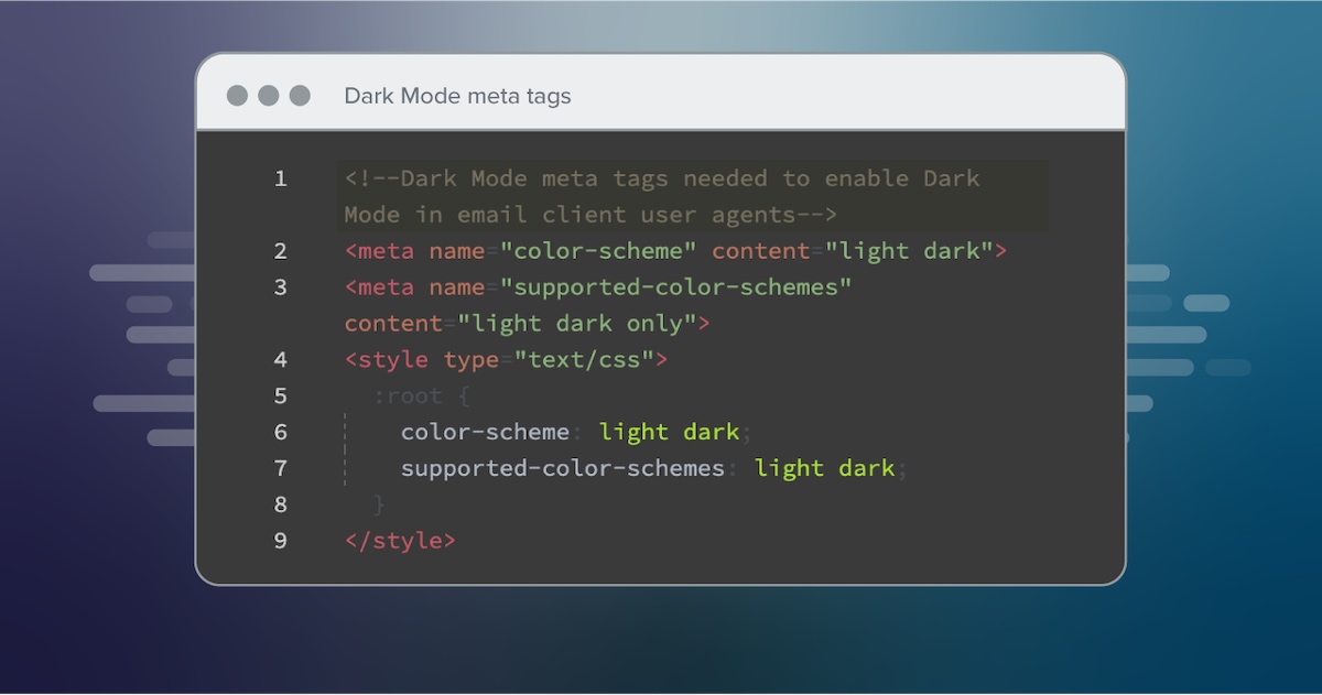
2. Enable Dark Mode in email client user agents
By including this metadata in your <head> tag, you can ensure that Dark Mode is enabled in your email for subscribers that have Dark Mode turned on:
<meta name="color-scheme" content="light dark"> <meta name="supported-color-schemes" content="light dark">
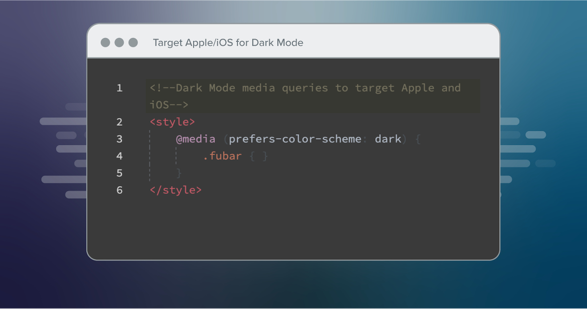
3. Add Dark Mode styles for @media (prefers-color-scheme: dark)
Add this Dark Mode media query in your embedded <style></style> section for custom Dark Mode styles in iOS, Apple Mail, Outlook.com, Outlook 2019 (MacOS), and Outlook App (iOS).
The .dark-img and .light-img classes are particularly useful for showing a dark mode-specific logo if having an outlined logo isn’t ideal.
Example CSS:
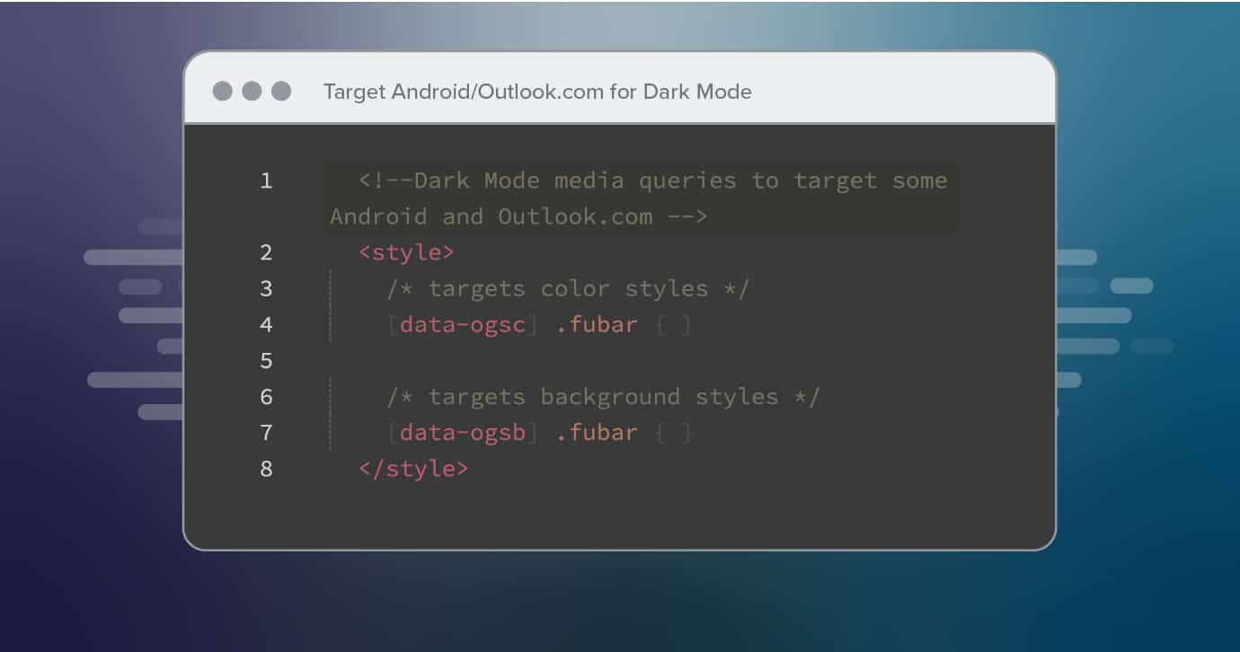
@media (prefers-color-scheme: dark ) { /* Shows Dark Mode-Only Content, Like Images */ .dark-img { display:block !important; width: auto !important; overflow: visible !important; float: none !important; max-height:inherit !important; max-width:inherit !important; line-height: auto !important; margin-top:0px !important; visibility:inherit !important; } /* Hides Light Mode-Only Content, Like Images */ .light-img { display:none; display:none !important; } /* Custom Dark Mode Background Color */ .darkmode { background-color: #272623 !important; } /* Custom Dark Mode Font Colors */ h1, h2, p, span, a, b { color: #ffffff !important; } /* Custom Dark Mode Text Link Color */ .link { color: #91ADD4 !important; } } 4. Duplicate Dark Mode styles with [data-ogsc] or [data-ogsb] prefix
Add this styling for support in Outlook app (Android).
Example CSS:
/* Shows Dark Mode-Only Content, Like Images */ [data-ogsc] .dark-img { display:block !important; width: auto !important; overflow: visible !important; float: none !important; max-height:inherit !important; max-width:inherit !important; line-height: auto !important; margin-top:0px !important; visibility:inherit !important; } /* Hides Light Mode-Only Content, Like Images */ [data-ogsc] .light-img { display:none; display:none !important; } /* Custom Dark Mode Background Color */ [data-ogsc] .darkmode { background-color: #272623 !important; } /* Custom Dark Mode Font Colors */ [data-ogsc] h1, [data-ogsc] h2, [data-ogsc] p, [data-ogsc] span, [data-ogsc] a, [data-ogsc] b { color: #ffffff !important; } /* Custom Dark Mode Text Link Color */ [data-ogsc] .link { color: #91ADD4 !important; } 5. Apply your Dark Mode-only styles to your body HTML
Make sure all of your HTML tags have the appropriate Dark Mode classes inserted. Here is an example of the .dark-img and .light-img classes as they appear in our Light Mode vs. Dark Mode logos.
Example HTML:
<!-- start HEADER_LOGO --> <a rel="noopener" target="_blank" rel="noopener" target="_blank" rel="noopener" target="_blank" href="http://litmus.com/" target="_blank"> <img class="light-img" src="https://campaigns.litmus.com/_email/_global/images/logo_icon-name-black.png" width="163" height="60" alt="Litmus" style="color: #33373E; font-family:'proxima_nova', Helvetica, Arial, sans-serif; text-align:center; font-weight:bold; font-size:36px; line-height:40px; text-decoration: none; margin: 0 auto; padding: 0;" border="0" /> <!-- The following Dark Mode logo image is hidden with MSO conditional code and inline CSS, but will be revealed once Dark Mode is triggered --> <!--[if !mso]><! --><div class="dark-img" style="display:none; overflow:hidden; float:left; width:0px; max-height:0px; max-width:0px; line-height:0px; visibility:hidden;" align="center"> <img src="https://campaigns.litmus.com/_email/_global/images/logo_icon-name-white.png" width="163" height="60" alt="Litmus" style="color: #ffffff; font-family:'proxima_nova', Helvetica, Arial, sans-serif; text-align:center; font-weight:bold; font-size:36px; line-height:40px; text-decoration: none; margin: 0 auto; padding: 0;" border="0" /> </div><!--<![endif]--> </a> <!-- end HEADER_LOGO -->
6. ABT: Always Be Testing!
As we always mention, email clients are constantly changing. Especially with a feature like Dark Mode, tweaks to rendering logic are frequent. The only way to be on top of it all? Test every email with a tool like Litmus.
Make Add-to-Calendar links a breeze with Litmus Personalize
In just a few clicks, you can create tailored subscriber experiences using proven personalization tactics such as add-to-calendar links, live polls, countdown timers and more.
Dark Mode image optimization
How can you make your image elements look great in Dark Mode, too? Here are essential tips and tricks for optimizing your imagery.
Designing your components
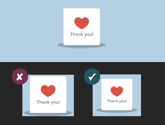
For your design components, you can go with a few stylistic options:
| Light Mode |  | |
|---|---|---|
| Controlled Dark Mode |  | |
| Uncontrolled Dark Mode |  | |
| Uncontrolled Dark Mode with glow effect |  | |
| Uncontrolled Dark Mode with stroke effect |  | |
| Uncontrolled Dark Mode with shape outline |  | |
| Uncontrolled Dark Mode with background |  |
To decide the best approach, ask yourself:
What matters most for this graphic—maintaining its original look and feel or ensuring it appears transparent?
-
If maintaining the look and feel is key: place the graphic on a background and flatten the image for consistency.
-
If transparency is the priority: add a glow or stroke to make the graphic stand out in Dark Mode.
Design techniques
Technique 1: Design with midtones
One approach is to focus on midtones, while accounting for accessible contrast ratios.
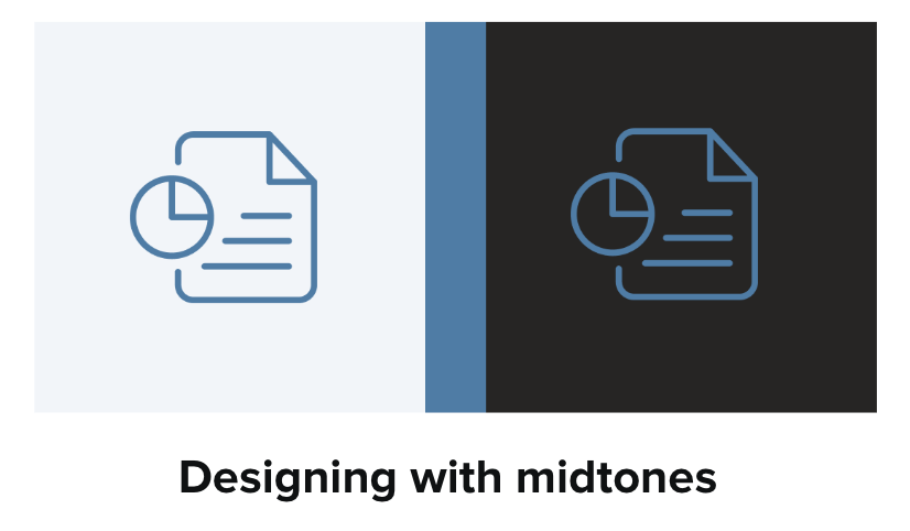
When designing with midtones, use a color that has a high enough color contrast for both white and black because it falls toward the middle of the value range.
Technique 2: Use a glow or a stroke
A glow or solid white stroke around an icon or logo can also help with readability, but it depends on the type of image or icon.
For transparent PNGs with dark text, adding a translucent glow works great.
Technique 3: Use a shape outline or background
Not a fan of a glow effects? You can put your icon on a background so it not only looks transparent on Light Mode but still works in Dark Mode where image swapping isn’t supported.
For stroke-based icons and illustrations, try adding a shape outline or background shapes behind them for a more visually appealing look.
![]()
Using APNGs
When it comes to animated GIFs, opt for APNGs. Instead of using GIFs to add animation to your emails, try using Animated Portable Network Graphics (APNGs).
GIFs don’t support transparency well:

White outlines can become pixelated due to a limited color range. On the other hand, APNGs generally do support transparency and have a wider color range.
Interested in giving animated APNGs a try? We cover that here. And give Fable a try for your next APNG!Respect user preferences when it comes to Dark Mode
One of the biggest benefits of Dark Mode is its assistance with reducing eye strain for people in low-light conditions or for other personal reasons. But it’s not a matter of Dark Mode vs. Light Mode. It’s a matter of what your subscribers want—whether that’s a dark or a light experience. There’s no right or wrong answer.
So, if your subscribers are making the conscious decision to view emails in Dark Mode, it’s best to respect that. Just like you’d want to add ALT text in case your subscribers prefer to have images off by default, you should build emails that respect darker interfaces, too.
Dark Mode and email accessibility
As mentioned earlier, some email clients make Dark Mode inherently inaccessible. While many are working on improving this, some don’t allow email developers to apply their own styles. Without proper implementation, this can negatively impact readability and accessibility.
Let’s dive into what that means in practice.
Is Dark Mode good or bad for accessibility?
Dark Mode can be both helpful and challenging for accessibility, depending on the individual user and how it’s implemented.
While it can improve readability for some, like individuals with cataracts, it can also introduce accessibility issues, including those with color blindness or dyslexia. The key is to offer a choice to enable or disable Dark Mode and ensure proper color contrast in any mode.
Solving email accessibility challenges in Dark Mode
One major challenge with Dark Mode emails? There isn’t just one version (as discussed earlier). A Dark Mode email can be rendered in three different ways:
-
No color changes: the email stays the same, regardless of the UI setting.
-
Partial color invert: light backgrounds are inverted to dark.
-
Full color invert: both light and dark backgrounds may be inverted.
This lack of standardization means you can’t fully control how your emails will appear to all subscribers. However, you can take steps to improve accessibility and readability.
Accessibility made simple
Creating accessible emails is no longer optional—it’s required. Learn about accessibility’s impact on brands from two industry experts.

Best practices for designing accessible emails in Dark Mode
-
Ensure high contrast ratios. Make sure your text stands out against the background in both light and dark modes.
-
Choose accessible colors. Use color combinations that are easy to distinguish for people with color blindness.
-
Design with midtones for better visibility. Use a palette of mostly midtones to ensure contrast against both light and dark backgrounds.
-
Prioritize user choice. Allow subscribers to switch between light and dark modes whenever possible.
-
Aim to meet Web Content Accessibility Guidelines (WCAG) standards. At minimum, ensure your colors meet WCAG Level AA compliance. To ensure your emails can be read by all subscribers, aim for Level AAA.
-
Use tools like WebAIM’s Contrast Checker to evaluate color contrast.
-
Avoid thin fonts. Light text on dark backgrounds can impact readability, and by using a thin font you can make it harder for subscribers to read your email. If your brand requires a thin font, bold it in Dark Mode for better readability.
-
Skip pure white on pure black: A #FFFFFF (white) background on #000000 (black) can cause eye strain and might be automatically inverted by some email clients.
-
Test your email renderings. Since Dark Mode behaves differently in various email clients, preview your emails in multiple settings before sending. Run a Litmus Test to see how your email renders across 100+ clients and devices.
-
Use a tool to preview your Dark Mode emails as you build them. See changes in real time, easily optimize on the go, and quickly check for visual accessibility issues with the Dark Mode coding experience in Litmus Builder.
Create emails that everyone can experience
Maximize your email’s impact by designing accessible content for all. Accessibility checks are always at your fingertips with Litmus.
Part 2: Dark Mode Email Code Snippets for Developers
How to design and code for Dark Mode emails
Below are nine code snippets from the email community to help solve your biggest Dark Mode challenges.
| ✂️ Click each image to get the code snippet! |
Dark Mode meta tags
Target Android/Outlook.com for Dark Mode
Target Apple/iOS for Dark Mode
Override Dark Mode background colors
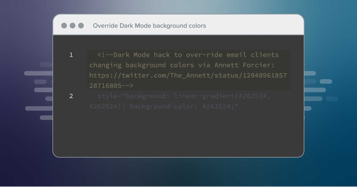 Credit: Annett Forcier. Grab the code in Litmus Community →
 Keep white text white in Gmail Dark Mode
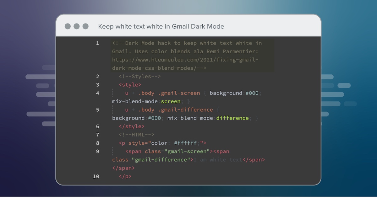 Credit: Rémi Parmentier. Grab the code in Litmus Community →
 Keep text the same color in Outlook’s Dark Mode
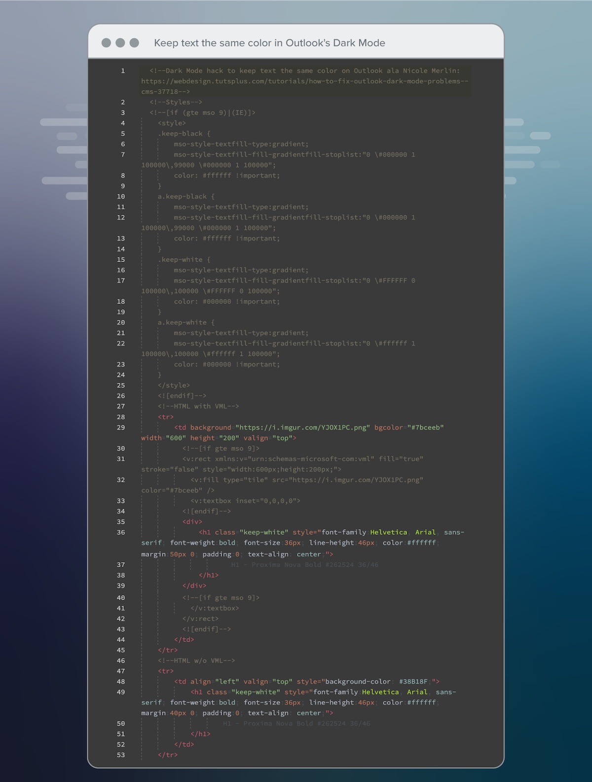 Credit: Nicole Merlin. Grab the code in Litmus Community →
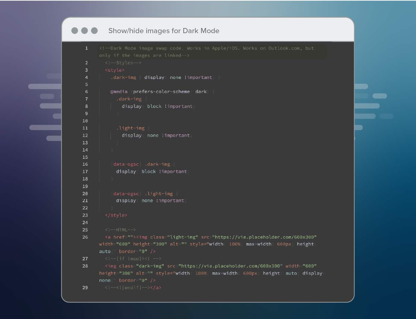
 Show/hide images for Dark Mode
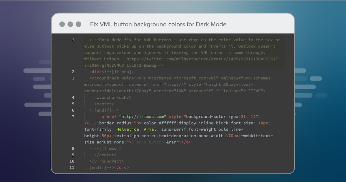
Fix VML button background colors for Dark Mode

- Credit to: Wilbert Heinen. Grab the code in Litmus Community →
Use off-white/off-dark colors to prevent color changing in Dark Mode
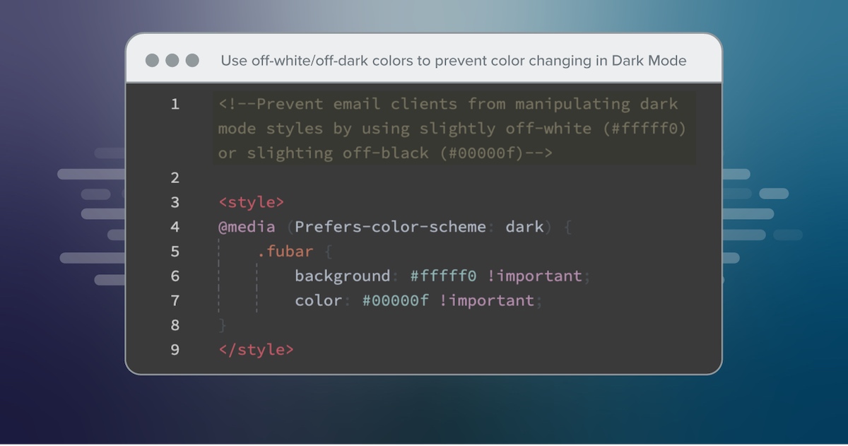 Credit: Ted Goas/Paul Airy. Grab the code in Litmus Community →
 Part 3: Dark Mode Tools & Tips
Email Community Favorite Email Dark Mode Tools & Tips
What Dark Mode best practices, tools and resources do your fellow #EmailGeeks rely on to learn more and overcome its challenges?
Check out this ever-growing list of external sources the email community recommends.
Is your favorite Dark Mode tool missing from this list? Let us know by emailing in to hello@litmus.com—we want to make sure this list is valuable to all users, and current.
1. To learn about Dark Mode in ⚡AMP Email
Dark Mode support isn’t only needed for HTML emails, but also AMP-powered emails.
There’s some bad news: there is currently no support for coding emails for Dark Mode in AMP email. However, Benjamin Djang has discovered an alternative solution to help your AMP Email look great in light and dark mode. Here’s how.
2. Keep your text content as black text on a white background
“One simple thing that works well is to keep your text content as black text on a white background. It does mean some limitations on your design, but there is still plenty of opportunity to get creative around the outside of the text and make things look great.”
Credit to: Mark Robbins
3. Set base styles for Dark Mode, update colors based on design
Add these base styles to all of your boilerplate email templates to ensure that every single one of your emails will be Dark Mode ready, even if you forgot to set Dark Mode styles up, explicitly.
darkbg { background-color: black !important; } .h1 { color: white !important; } .h2 { color: white !important; } .button { background-color: white !important; color: black !important; } Credit to: Emmanuel Arizmendi
4. Resources for auto-inverse email clients
Outlook and Gmail both fully invert the color scheme of your emails to support Dark Mode. Although we cannot target those clients, these awesome email geeks have some tips to help you make the most of these situations.
- @Outlook: https://webdesign.tutsplus.com/tutorials/how-to-fix-outlook-dark-mode-problems–cms-37718
- @Gmail: https://hteumeuleu.com/2021/fixing-gmail-dark-mode-css-blend-modes/
Credit to: Emmanuel Arizmendi
5. To create an HTML email that reacts to Outlook.com’s dark and light button
A handy feature of Outlook.com is a light mode/dark mode button, where users can manually select which version they would like to use to view emails in. Unfortunately, this handy feature comes with a drawback. Some users see the dark mode version of your email instead of the light mode version—even if they have selected to view emails in Outlook.com in light mode.
Here are some tips to get around this issue.
Credit to: Rémi Parmentier via Wilbert Heinen
6. How to fix Outlook Dark Mode problems
Due to Microsoft Outlook’s full invert, your subscribers might see unpredictable text color changes in Outlook. These changes can make your emails harder to read. Email developer, Nicole Merlin, has a way around that.
Credit to: Nicole Merlin
Part 4: The Dark Mode Toolkit
Download Your Free Email Dark Mode Toolkit

We compiled our favorite Dark Mode resources in our Dark Mode Toolkit. Here’s what you’ll get:
- The Ultimate Guide to Dark Mode Email, our comprehensive guide to everything you need to know about Dark Mode
- A 1-hour recording showing how a Dark Mode email is coded in real time
- Code snippets to help you add Dark Mode support to your existing emails
- And a Dark Mode-ready template to get you started right away
Download The Dark Mode Toolkit and get started or level up your Dark Mode game today.

Carin Slater was the Lifecycle Email Marketing Manager at Litmus.
